Design Controversy: When Football Jerseys Spark Debate and Fan Protests
Muhe - Friday, 01 August 2025 | 03:00 AM (WIB)
More Than Just Fabric: The Emotional Connection
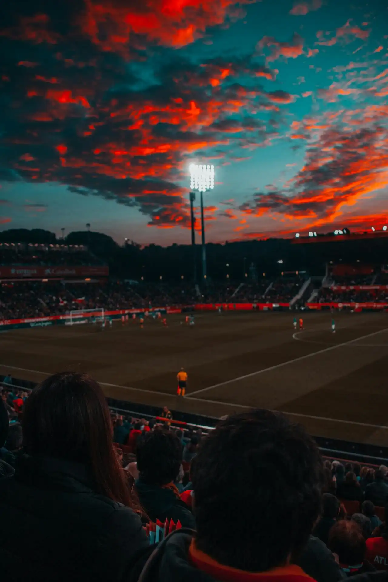
To truly get why a new jersey design can send ripples of fury through a fanbase, you have to understand the deep, almost spiritual connection fans have to their club's colors and crest. This isn't just about fashion trends or what's 'in' this season. These colors represent generations of loyalty, epic victories, heartbreaking defeats, and a shared history that binds millions. Think about it: a club's traditional stripes, a specific shade of blue, or a classic collar design isn't just arbitrary; it’s part of the club's DNA, a visual shorthand for its soul. When a designer, perhaps a bit too eager to be "disruptive," decides to radically alter that heritage, it feels like a personal affront. It’s like someone came into your home and rearranged all the furniture without asking – but on a global scale. It hits different.When Designs Go Sideways: Infamous Cases
The annals of football fashion are littered with examples of kits that, well, missed the mark spectacularly. These aren’t just minor missteps; they’re often perceived as outright betrayals. Take, for instance, the infamous "away kit" fiascos. We've seen teams traditionally donning red suddenly appear in bizarre lime green, or a club known for its classic hoops adopting a jagged, abstract pattern that looks more like a modern art experiment than a football shirt. Fans often ask: what gives? Did anyone in the design studio even glance at the club’s history?One classic controversy often involves radical departures from traditional home kit designs. Remember when a certain top-tier European club, known for its iconic vertical stripes, released a home kit with horizontal stripes? The outrage was immediate and visceral. Social media went ballistic. Memes flooded feeds, fans threatened boycotts, and sports commentators dedicated entire segments to dissecting the "betrayal." For many, it wasn't just an ugly shirt; it was an abandonment of a centuries-old identity. It felt like the club was sacrificing its soul for a quick buck or a misguided attempt at being 'fashion forward.' Major cringe for the loyalists.Then there are the kits that just look… odd. From busy, chaotic patterns that induce headaches to colors that clash so violently they should come with a warning label, these designs often provoke widespread ridicule before outright anger. Sometimes, it’s the quality too. Imagine dropping a hefty sum on a new kit, only for the crest to peel off after two washes, or the fabric to feel like a glorified bin bag. When combined with a design that's already controversial, it just adds insult to injury and fuels the protests even further.
Liverpool vs Arsenal Prediction: Week 3 of the 2025/2026 Premier League
14 days ago

Rayo Vallecano vs. Barcelona Prediction: Week 3 of La Liga 2025/2026
14 days ago
Messi's Last Dance? The GOAT Hints at a Potential World Cup Farewell in 2026
15 days ago
Real Madrid vs Mallorca Prediction: Los Blancos Aim for Third Consecutive Win
15 days ago

West London Derby: Chelsea vs. Fulham Prediction, Week 3 Premier League Match
16 days ago
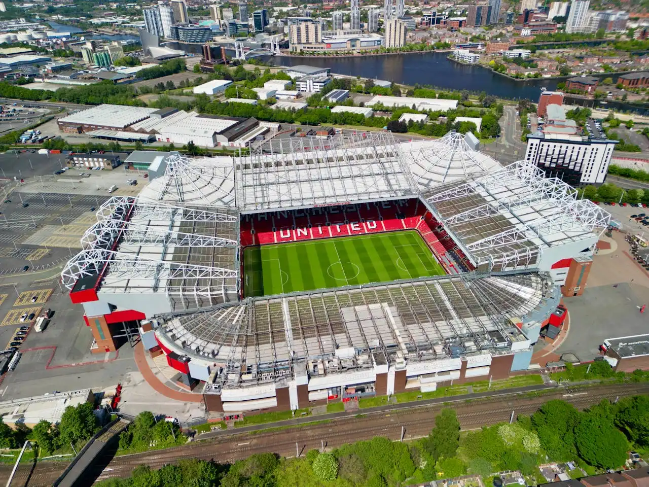
Manchester United vs Burnley Prediction: Tough Test at Old Trafford
16 days ago
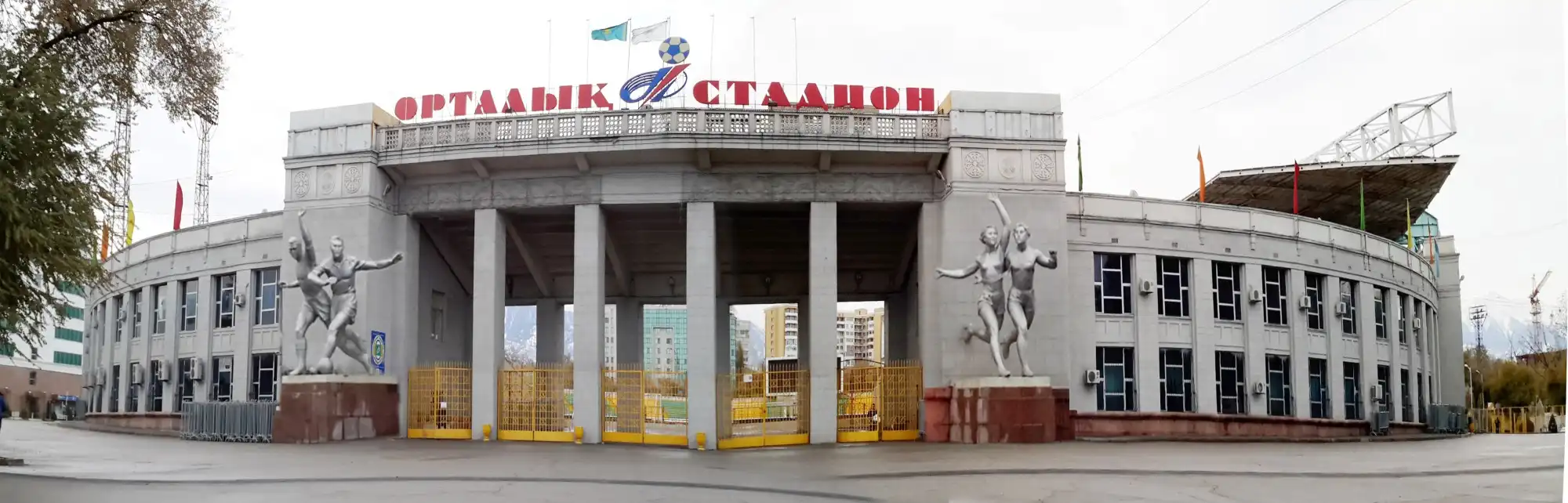
The Roar of History: Why Almaty Ortalık Stadium Isn't Just a Venue, It's Kazakhstan's Heartbeat
16 days ago
Wayne Rooney’s Stark Warning: Can Manchester United Still Attract Elite Managers?
16 days ago
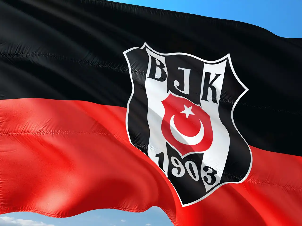
The End of the Road: Ole Gunnar Solskjaer's Turkish Adventure Concludes Abruptly at Besiktas
16 days ago
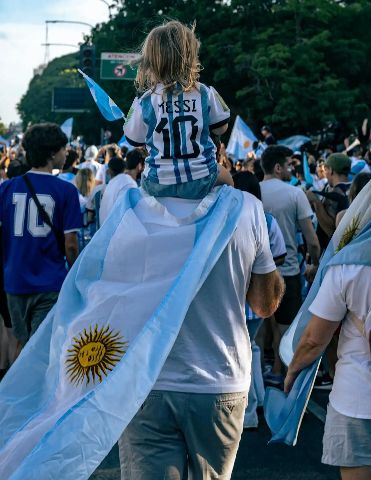
Argentina vs. Venezuela: Lionel Messi's Final Moments in Home?
16 days ago